Website development and the technical support that follows are our main line of work, which is why we are so often asked to price a project with no specification at all, or simply to show what such a document should look like. That is exactly why we prepared and published, in open access, a typical example of a full-scale specification for building an online store selling electronics and home appliances. Clients can use it as a basis for drawing up their own specifications for their own projects.
We developed and published, in open access, a typical example of a full-scale specification for building an online store, so that our clients could use it as a basis for creating their own specifications for their own projects.ANIART, from the introduction to the document
1. Project scope
The first thing any specification begins with is a list of the functions that have to be implemented. In this example the project scope is described as follows:
- Implementation of a product catalog (electronics and home appliances at the first stage, other product groups later) with filtering and convenient navigation.
- In the product catalog an individual filter must work for each product group. Filter parameters are agreed separately for each group.
- Presentation of products together with their characteristics — full product information on the detail page, with the option to buy.
- Implementation of the ordering process — choosing the delivery location, the delivery method and the payment method.
- The project is expected to launch in Azerbaijani; Russian will be connected at the next stage.
- Functionality is extended at the client's request after the first stage of the project goes live — either as individual improvements or as whole stages.
2. Terms used in the document
So that the client and the development team read the document in the same way, the specification opens with a glossary. This is not a formality: most disputes at hand-over arise precisely because the words “module”, “section” and “panel” are understood differently.
| Term | Definition |
|---|---|
| Template | A prepared mock-up of the graphic presentation of the site. |
| Service module (module) | A functionally complete software block intended to perform a specific practical task. Unlike pages, service modules have no user interface of their own on the site; instead they receive the data entered by the visitor from pages and/or read data from the database and process it according to a defined algorithm. The result of a module's work may be the output of search results to a page, a modification of the database, or the sending of email correspondence. |
| Information panel (panel) | Visually grouped content, navigation or indicator elements. |
| Site section (section) | The largest structural element, which groups the pages of the site on the principle of forming a logically complete body of information. |
| Site subsection (subsection) | A structural grouping of site pages inside one of its sections. |
SEO requirements
SEO requirements are set out in a separate document — an appendix to the specification. The body of the specification itself refers to it wherever SEO affects markup and content (for example, the SEO areas on the home page and in the catalog).
3. General functionality
This section describes the mechanics that work the same way on any page of the site — so that they do not have to be repeated in every following section of the specification.
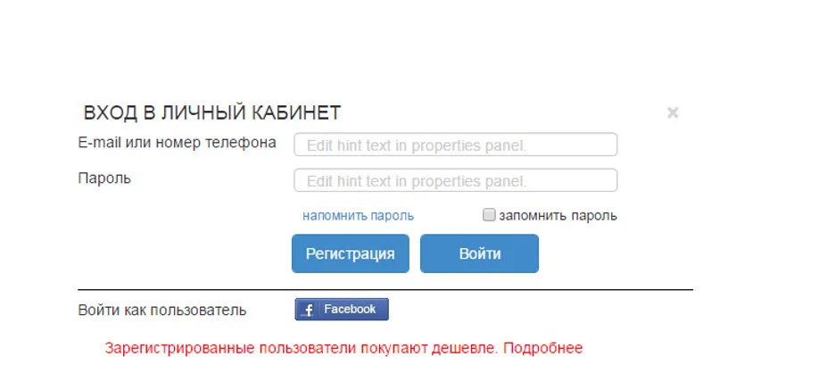
- Besides the standard authentication (login and password), external authentication is used — through the Facebook social network.
- The values of properties and characteristics are not displayed when the entity does not have them.
- In every area that uses a table-and-row presentation of a product, the standard catalog presentation of the product is applied, unless stated otherwise.
- “Order in 1 click” — a function available for creating an order without entering the data required by the full checkout procedure. Only a phone number has to be entered: a virtual user is created in the system, and the current product or the contents of the cart (depending on where the function is placed) is put into the order. If the user is logged in, the phone number is not requested — the order is placed immediately and the user moves to Step No. 3 of checkout, with the order matched to the current user.
- Cities and points of sale (pick-up points) — two reference lists are defined in the system: “cities for pick-up and delivery of goods” and a “list of points of sale / pick-up points” linked to a city.
- Login, registration and password recovery forms. All pop-up input forms are made in a single style; the user's EMAIL or PHONE is used for password recovery.
4. Home page
In the document the home page is split into three parts — upper, middle and lower — and each part into numbered areas. This split is convenient because the designer, the front-end developer and the programmer all work with one and the same numbering.

Upper part of the page
Area No. 1. It contains:
- The top banner (type TOP_PAGE). If there are no banners of this type in the system, the entire banner area is not shown.
- Language switching — implemented by moving the user to the home page of the site in the chosen language.
- The mechanism for choosing the current store: the area contains a drop-down window that makes it possible to choose a store — a two-step choice of city, then store. Stores are structured by city by the site administrator and supported by a data exchange mechanism with an external accounting system. The location of the store can be viewed on an interactive map.
- Entry to the user's section (pop-up login form). If the user is logged in, their full name is displayed instead of the word “login”.
Area No. 2. It contains:
- The top menu — contains links to general information (payment, delivery, warranty, contacts). The menu can be changed using the standard system mechanisms.
- The company logo. On every page except the home page, clicking it takes the user to the home page in the current language.
- The search system. The full or partial name of a product can be entered in the input field; from the fourth character onward the system starts suggesting products in a dropbox by substring match on the current input. A product card can be opened from the suggested list. There is also a search variant in which the product name is typed into the input field and Enter is pressed — after which the system returns, on a separate page, the list of products matching the condition with page-by-page presentation (see the description of the “search results” page). A drop-down list of first-level catalog sections is used to control the scope of the search. Below the search bar there is a hint with the most frequent search queries separated by commas: clicking a query moves it into the search bar. Search hints are changed through an includable area.
Area No. 3 — the main product menu. The first level is built from the main catalog sections. When a section is selected, the remaining subsections expand into a drop-down menu. The drop-down menu contains the expanded structure of the selected section, a “marketing offer” or a background image — displayed in exactly that order. There may be several marketing offers for a single section. Selecting a marketing offer takes the user to a product card or to a promotion page.
Area No. 4 — the main banner area. Built from banners of the MAIN_PAGE type. Banners are cycled both by timer and manually. Above the banners there is a classification of the banners being shown: top promotions, new arrivals, special bundles. If there are no banners of a given class, the corresponding type is not shown in the classifier. Below the main banner there is a row of marketing differentiators: warranty terms, discount terms and so on. The elements consist of an image, the name of the marketing differentiator and explanatory text. The block can be changed through the “includable area” tools.
Area No. 5 — “top sellers”. The row is made up of products carrying the “top sellers” marketing attribute; products that have priority in the SORT field and non-zero stock make it into the row. All products are displayed according to the “Standard presentation of a product in the catalog”, and the product's section is additionally displayed for each product. Scrolling products inside the block is not provided. All products with the “top sellers” attribute can be viewed (the “All” link) on a separate page with page-by-page navigation; the “Standard information page” layout is used to present all such products.
Area No. 6 — “offer of the week”. The block is made up of products carrying the “promotion” marketing attribute; products with priority in the SORT field and non-zero stock make it into the block. All products are displayed according to the “Standard presentation of a product in the catalog”. Scrolling products is not provided. At the top of the block a countdown timer is shown for the promotion on the product whose end date is nearest.
Middle part of the page
Area No. 1 — the “information insert”. It consists of three blocks in the following order: banner + review + banner. The blocks may contain:
- Advertising banners (type MIDDLE_MAIN_PAGE) — consisting of images, text and controls.
- An item from the “Reviews” section — a review of a product, a product line and so on; it consists of images, text, controls, and also the “details” and “all reviews” links. The “show on home page” attribute in the review is used to select a review for the home page, and the value of the SORT field is used for ranking. The “Standard information page” layout is used to present all reviews.
If there are not enough elements of one of the types, the required slot is filled with the other type.
Area No. 2 — “new arrivals”. The row is made up of products carrying the “new arrivals” marketing attribute; products with priority in the SORT field and non-zero stock make it into the row. All products are displayed according to the “Standard presentation of a product in the catalog”, and the product's section is additionally displayed for each product. Scrolling products is not provided. All products with the corresponding attribute can be viewed (the “All” link) on a separate page with page-by-page navigation; the “Standard information page” layout is used.
Area No. 3 — “coming soon”. The row is made up of products carrying the “coming soon” marketing attribute; products with priority in the SORT field make it into the row. All products are displayed according to the “Standard presentation of a product in the catalog”, except for the “Buy” button, plus the product's section is displayed for each product. Instead of “buy” a “notify me when it arrives” button is displayed: when it is selected, a phone number or EMAIL is requested if the user is not logged in, and when the product arrives in stock a notification is sent to the user. Scrolling products is not provided. All products with the “coming soon” attribute can be viewed (the “All” link) on a separate page with page-by-page navigation. If there are not enough products to fill a full screen-wide row, the area is not shown.
Lower part of the page
Area No. 1 — the “You viewed recently” row. The row is made up of products the current user has viewed while browsing the site; products are sorted by viewing time, in descending order. Products inside the block are scrolled by the “load on request” method. If there is not enough data for the current user, the shortfall of products in the row is topped up with products carrying the “top sellers” marketing attribute. All products are displayed according to the “Standard presentation of a product in the catalog”.
Area No. 2 — the “Useful reviews” block. The block takes in items from the “Reviews” section — a review of a product, a product line and so on; it consists of images, text, controls and the “details” link. Ranking by the value of the SORT field is used to display a review on the home page. The “All” link is used to present all reviews — it takes the user to the “Reviews” page.
Area No. 3 — the SEO area. It is filled according to the rules in the “SEO” appendix, or the text is edited directly.
5. The “Product catalog” page
The layout of the “Product catalog” page is described separately — see “page layouts” — “Product catalog”. This section of the specification itself begins not with markup but with the reference lists that everything else depends on: marketing attributes, price types, discounts and coupons.
Marketing attributes and price types
Marketing attributes for products used in the system (the number of attributes may change):
- New arrivals
- Bestsellers
- TOP sellers
- “Coming soon”
- Clearance −30% and so on
- Each attribute can be presented with an additional image
Price types used in the system (the number of prices may change):
- Base price
- Promotion price No. 1 … promotion price No. n and so on
- Credit price
- Credit instalment
- Bundle price — bundles are handled differently: a “bundle” entity is created, and the price of the product within that particular bundle is set there. This is done because the same product may have a different price in different bundles.
Several price types may be assigned to a product in the system. The price displayed as the selling price for the product is the one that has sale permissions set and that is optimal (the lowest) for the current user. A separate presentation template, agreed for each promotion, may be used to present the “old” and “new” prices. The way the price difference is presented must be configurable: the discount % or the amount saved.
Discounts
The discount management system makes it possible to set up several discount plans that depend on the total value of the order. Discounts can be defined either as a percentage or as a fixed amount. The discount is calculated from the total value of the order, excluding the delivery cost.
| Discount parameter | What it defines |
|---|---|
| Start and end date | The period during which the discount is valid. |
| Discount type | A percentage or a fixed amount. |
| Discount value | Depending on the chosen type, it is specified as a percentage of the product's value or as a fixed amount or price. |
| Maximum discount amount | The largest possible size of the discount. The value of this field is most often set for the “percentage” discount type. It is specified in the base currency of the discount chosen in the previous field. |
| Application priority | The higher the numeric value of the priority, the earlier the discount is applied. |
| Stop applying further discounts | When this option is ticked, no other discounts are applied to the product. |
| Restrictions | The user groups that may use the discount; the price types the discount applies to. |
| Promo codes | The list of promo codes linked to this discount. |
Coupons (promo codes)
A coupon is a kind of discount. What makes it different is that a coupon is a unique, randomly generated sequence of characters. The right to receive the discount belongs to the buyer to whom that unique sequence of characters has been communicated in one way or another. Coupons are logically linked to discounts: when a coupon is activated, the corresponding discount is applied to the order.
- A coupon for a single order line.
- A coupon for a single order.
- A multi-use coupon.
Upper part of the catalog page

A left-hand product menu like the one on the home page is not provided on catalog pages. Its role is taken by an extended breadcrumb navigation.
Area No. 1 — breadcrumb navigation. It is built from the nesting hierarchy of product section names, by depth from the root down to the current section in the catalog tree. For every section in the breadcrumb navigation a drop-down list is built of the sections at the same nesting level of the catalog tree that the current section belongs to.
Area No. 2 — the product filter. The filter is built for each section — the last level of the hierarchy, which holds products with the same characteristics. How the filter works:
- Only the characteristics defined for this product group must be shown in the filter.
- For every characteristic value, a figure shows how many products will be selected if that value is switched on in the filter.
- Through metadata, a display type can be set individually for each characteristic: multiple choice; a slider of numeric values without discrete steps; a “yes/no” toggle.
- An individual display template can be set for each characteristic — for example, with icons or images next to every value.
- If there are no values of a characteristic among the current products, that characteristic is not shown in the filter.
- If a particular value of a characteristic is absent among the current products, that value is not shown among the choices.
- The filter by marketing attributes is placed in a separate block.
- At the top of the filter, when filter parameters have been chosen (the filter is on), a block with the chosen parameters is displayed; parameters can be excluded from the filter one by one or all at once. The number of products selected by the filter can be displayed in this same block.
- Filtering by tags — a grouping of products outside the catalog — is implemented separately.
Area No. 3 — the product display area. Preset parameters are used for sorting: price, popularity, new arrivals. In future, product presentation options can also be placed here: list, table, table with preview, price list.
Standard presentation of a product in the catalog
The standard presentation of a product in the catalog consists of two states — “normal” and “on cursor hover”.
The “normal” state
The product name — the design has to allow for both long and short names. The product photo — the image dimensions are defined by the design. The marketing attribute — if the product has several attributes set, one is displayed, based on the priorities in the “Marketing attributes in use” list. The current price. The brand — the brand logo; if it is not defined, it is not displayed, and the image size is defined by the design.
The “on cursor hover” state
Added to what is present in the “normal” state: the product SKU; the ability to scroll through the product images (side carousel arrows, images loaded via AJAX); the “Buy” button; the “to comparison” and “to favourites” links; tags; the “Order in one click” button; a short description of the model (a separate field in the product card).
More detail on the elements of the “on cursor hover” state:
- The “Buy” button — once the product is added, a pop-up window with the contents of the cart appears (see “Pop-up cart”).
- The “to comparison” link — adds the product to the comparison list. If the product is already in the comparison, the link changes to “in comparison” and on click leads to the comparison page; an icon for removing it from the comparison appears next to it.
- The “to favourites” link — adds the product to the wish list. If the product is already in the “wish list”, the link changes to “already in the list” plus an icon for removing it from the “wish list”. Clicking “already in the list” leads to the “wish list page”.
- Tags — groupings outside the catalog for alternative cataloguing. They are not clickable.
- The “Order in one click” button — when this button is selected, the user is asked to enter a phone number; once it is entered, an order is created in the system with a virtual user (if the current one was not logged in).
The document separately records the question of whether the “Buy” button should be visible in the normal presentation as well — this is open to debate, and it is decided on the basis of statistics on purchases made from the catalog.
Page-by-page navigation and advertising inserts
When the product table is displayed in the catalog, page-by-page navigation and “loading more products on demand” are used. The number of products loaded at a time is set administratively. Page-by-page navigation works together with “load more”.
The “advertising insert” in the table shown in the catalog is built from banners of the CATALOG_CUT type. Banners to be shown in the middle of the page are chosen by the rule “random according to weight”. In the catalog the banner is shown on the first page only.
| Banner type | Where it is shown |
|---|---|
| TOP_PAGE | The top banner of the home page. If there are no banners of this type, the whole area is not shown. |
| MAIN_PAGE | The main banner of the home page, cycled by timer and manually. |
| MIDDLE_MAIN_PAGE | Advertising banners in the “information insert” of the middle part of the home page. |
| CATALOG_CUT | The “advertising insert” in the catalog product table, on the first page only. |
How area visibility behaves during vertical scrolling
This is the case where a written description in the specification saves weeks of rework: the behaviour of the “sticky” filter is described step by step, not with the phrase “the same as everywhere else”.
- Scrolling down. The content of filter area “1” and product area “2” moves up in sync until the upper part “3” disappears beyond the edge of the browser window. In other words, both areas move up in sync as long as the “site header” is within the visible part of the browser window.
- The header has disappeared. Once the “site header” area “3” has disappeared beyond the top edge of the browser window, area “1” stops moving up. Area “2” carries on moving up — that is, area “1” stops (freezes).
- The lower row has appeared. When the “You viewed recently” row appears in the visible area of the browser, area “1” resumes moving up in sync with area “2” — that is, it “unfreezes”.
- Scrolling back up. If the user starts scrolling in the opposite direction, area “1” starts moving down once its upper part is level with the upper part of area “2”.
Lower part of the catalog page
- Area No. 1 — the “Useful reviews” row: displays product reviews relating to the current section.
- Area No. 2 — the “You viewed recently” row: its content and functionality match what is described in the “home page” section. The row is placed across the full width of the screen.
- Area No. 3 — the SEO text: it is placed after the “You viewed recently” row and is built from a template for each section, or it can be set individually for each section.
- The lower “footer” block — its content and functionality match what is described in the “home page” section.
6. The pop-up cart
The layout is described separately — see “page layouts” — “Cart”. After the “Buy” button is pressed on any page where a product can be bought (the product catalog, the product detail page and so on), the user is shown the “pop-up cart”.

The cart displays:
- The products and bundles selected for purchase.
- “Promotional offers” — bundles — are highlighted separately: such products cannot be removed individually, the whole bundle is removed at once.
- The “go to checkout” link — the user arrives at “Step No. 1” of order checkout.
- “Buy in 1 click” — the user enters a phone number, after which an order is created in the system with a virtual user (if the current one was not logged in).
- “Continue shopping” — the link returns the user to where they were before.
A detailed description of how this functionality is built and the rules by which it works is given in the “product detail page” section.
7. How to use this template
The document above is a working framework, not a text written for the sake of form. If a specification is drawn up on its basis, most of the questions that usually come up at the acceptance stage are settled before development even starts: everyone involved understands the terms in the same way, knows the numbering of the areas, and can see the rules governing the filter, discounts and coupons.