A design is successful when it converts ordinary visitors into engaged users at a high rate. After all, a person may leave the page if they cannot find the information they need, or if they find the design irritating. So how do you know it is time to change something?
Signs that your site needs a redesign
So what exactly are the signs that your site needs a redesign?
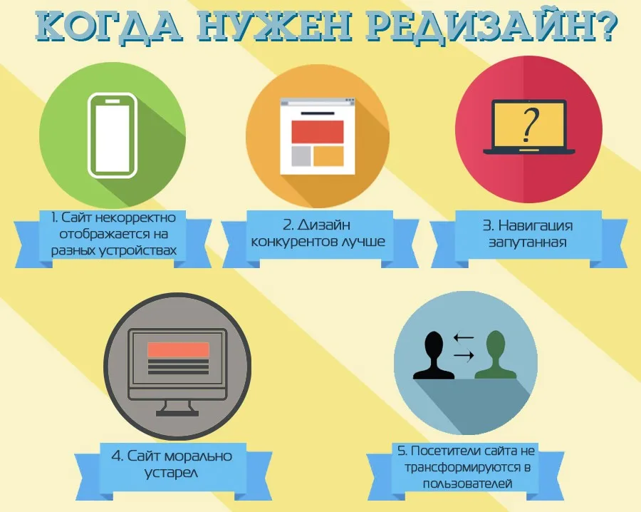
- The site does not display correctly across different devices.
- Your competitors' design is far more appealing to customers.
- Most of your visitors never turn into users.
- Your site performs extremely poorly in search engines.
- Navigation is confusing and the software modules are hard to maintain.
- The site has not been updated in a long time and feels dated.

When call centre dominance becomes a problem
Another important sign that an online store needs an immediate update is how placed orders are split between the call centre and the site. When the balance tips heavily in favour of the former, it overloads your managers and significantly slows down the whole company. The result is a constant need for more and more staff, low efficiency of the web resource, and shrinking sales margins.
A redesign is more than graphics
Modern web design is not only about creating graphic elements. It also covers the comprehensive preparation of every piece of functionality you need: content, logo adjustments, building themes for popular platforms, analytics and so on. It is a large set of tasks that matters both at the level of each individual component and as a whole.
Developers are often given a demanding mission: to optimise how the site works and bring it in line with the requirements of today's market. So how can that be achieved?
Ten areas that deliver results
Working on search engine optimisation
For many sites this is the core source of visits, and handled properly it can increase organic traffic by 5–7 times.
Working with analytics
Implementing Google Universal Analytics lets you study user actions on the site in detail, while QlikView helps to visualise and analyse sites.
Responsiveness
Correct display across all kinds of devices, operating systems and browsers lets you reach and retain your target audience in full.
Promoting campaigns and special offers
Promotional offers are among the main sales drivers. It makes sense to present them as a separate block to catch and hold the user's attention.
A thoughtful approach to the visual side
An experienced designer and developer understands the mechanisms of human perception well, and how to apply them in their work. For instance, most products are usually photographed on a white background, which is fairly high-contrast in itself — so the page looks busy. Cutting out every image is long, tedious work. A far more effective solution is to add a highly transparent coloured layer at the HTML markup level, which disappears when the user hovers over an object, making it stand out from the rest.

Choosing the right product blocks
Product blocks are chosen according to the purpose of the site. They can differ by photo type (horizontal and vertical), by status (in stock, made to order) and so on. The most effective are blocks of the standard size — 200×300 pixels. For responsive sites, the principle of progressively revealing more information works well: it strikes the golden mean between search optimisation and comfortable reading.

Using commercial promotion channels
Commercial channels are a far more profitable direction than technology-heavy ones, which require significant spending yet deliver low traffic growth.
Working with registered users
Statistically, between 12% and 16% of site users sign in, which makes it possible to communicate with them by email.
Internal logic of the structure
The logical hierarchies behind the header and navigation create a clear structure, while elements reinforced by various techniques create the right accents.
Traffic analysis
Sessions, page views, bounces, along with on-page clicks and entry points, help build a clear picture of user behaviour.
Among commercial channels it is worth highlighting search traffic, direct mail and affiliate marketing, which together can account for up to 70% of traffic and deliver around 80% of sales. And well-organised mailings — regular, promotional and triggered alike — can increase sales through this channel by a quarter.
Pictograms and icons, in turn, help to visualise information and link it intuitively to the right associations. That way you can immediately focus the customer's attention on what matters most.
What it all adds up to
A redesign helps to increase the number of pages viewed per session from roughly 2.6 to 3.7, and raises conversion by more than 30%.
Well-tuned recommendation algorithms combined with order confirmation by phone increase sales margins by 21% at a relatively low cost in time.
| Order placement method | Share of orders |
|---|---|
| Automated, through the site | over 70% |
| Call back | just under 20% |
The upsides of a redesign
Current trends, fresh SEO content, an understanding of the customer gained through solid analytics — all of this improves how the business works overall, saves both human and financial resources, and drives revenue growth.