About the technology
CSS3 turns markup into living design: the colours, typography, layout and motion that make a store recognisable and comfortable to use. Modern Flexbox and Grid let us build a responsive layout that looks right on a phone, tablet and large screen alike — which is conversion itself, since most purchases now come from mobile. Browser-level animations and transitions run smoothly without weighing the page down, unlike heavy scripts.
CSS3 handles the entire look of a store — layouts, responsiveness across every screen, animations and brand styling that behaves identically in all modern browsers.
Where we used it
Real cases built with CSS3. Click a card to open the project.
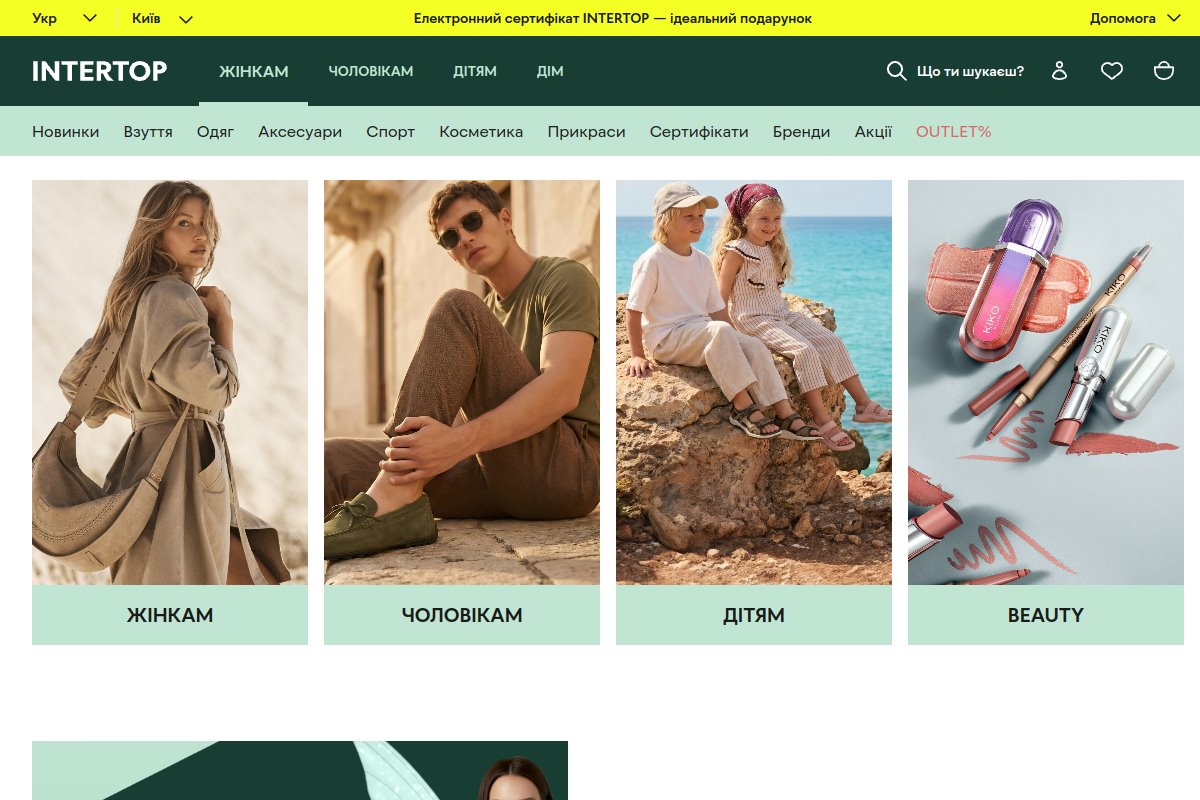
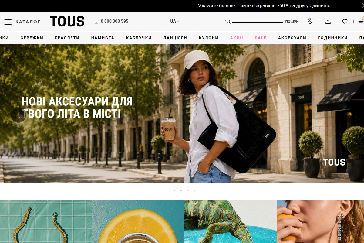
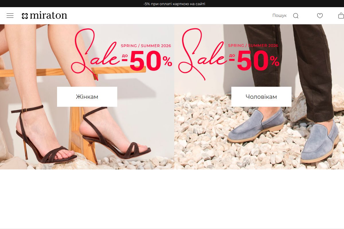
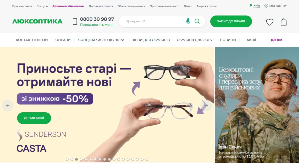
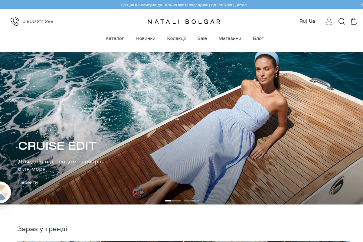
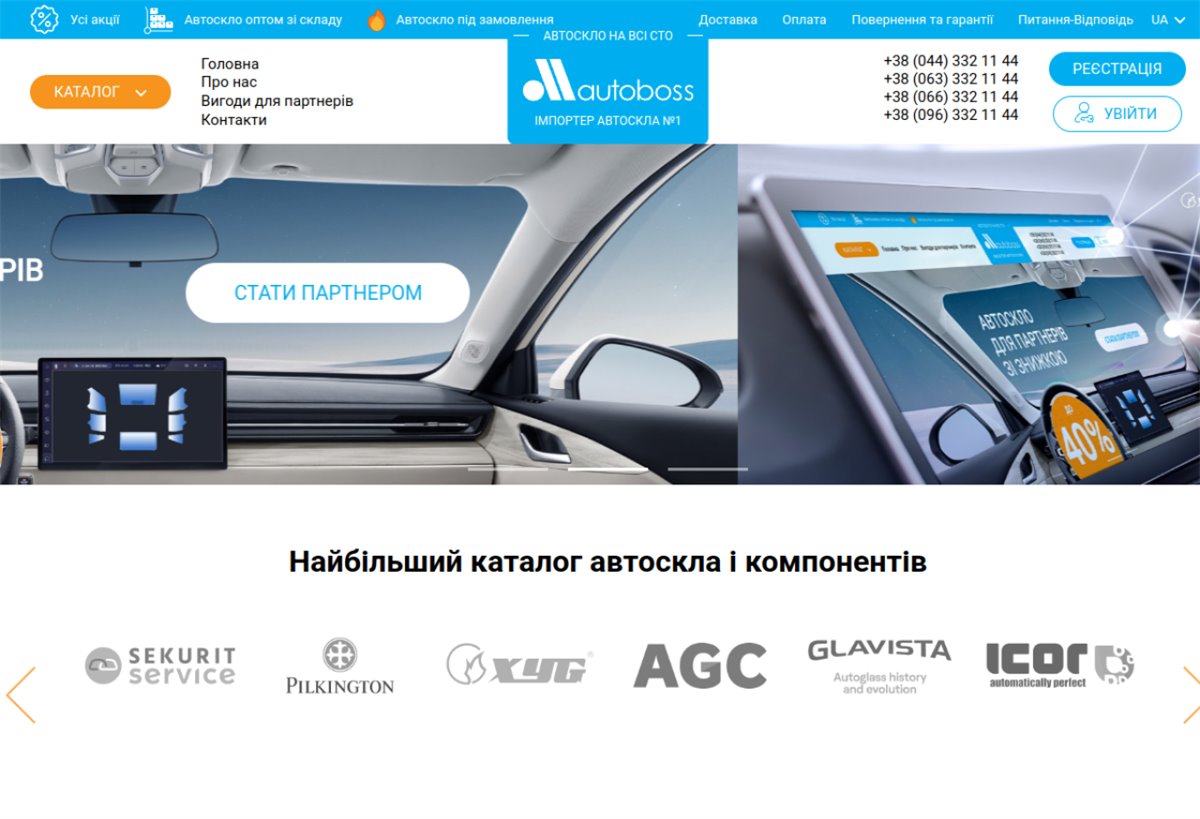
These are only some of the projects built with this technology — the full list is available on request.
Get an estimate for your project
Leave your contacts — we will get in touch, clarify the details and send a rough quote and timeline.